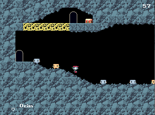
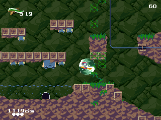
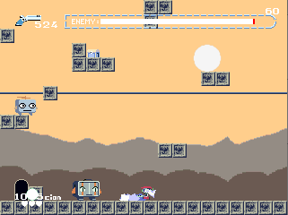
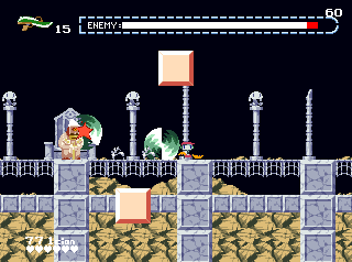
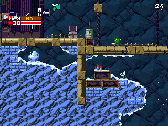
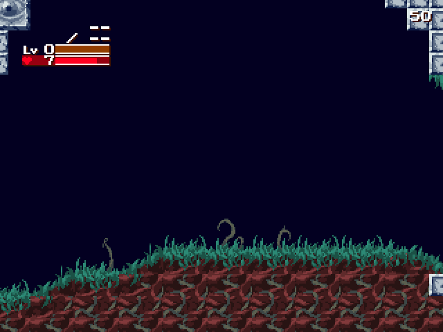
'hm i wonder how long it's been since the last major evergreen update'
> december last year
'ah fuck'
...yeah, all i really have is the usual excuses - work's been taking up a lot of my energy and i can't wrangle my brain into being interested in modding at the moment, so even though i'm almost done with this next big update i haven't been making any progress and it's really frustrating!!! gah!!!
hum, i guess i did redraw caret's portraits recently, there's that...
(new)
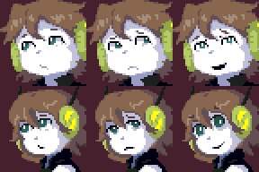
(old)